
Black, White, And The 2026 Color of The Year
Few design palettes stand the test of time quite like black and white. They’re timeless, versatile, and endlessly adaptable. Yet, even the classics evolve. At ONYX + ALABASTER, two of our designers, Jennifer Mullin and Evan Stephens, have been reflecting on the newest color directions emerging as we move toward 2026.
These shades are far from static. They’re nuanced, textured, and capable of transforming spaces in unexpected ways. Here’s a closer look at the shades we love, how we’re using them, and tips for weaving them beautifully into your own home.
The New Era of Black

While we chose timeless black in this historic Franklin Home a couple of years ago, Black remains one of the most powerful tools in a designer’s palette. Take Sherwin-Williams’ Iron Ore, for example. It continues to deliver when used with intention. Right now, our team is using Iron Ore in a color-drenched home library. By wrapping the walls, trim, and ceiling in this deep, dramatic hue, the space becomes a cocoon: sophisticated, moody, and perfect for quiet reading or late-night conversations. We will share those photos soon.
Still, we’re also looking beyond Iron Ore to expand the range of blacks and near-blacks available to our clients. Some of our current favorites include:
Black Fox (Sherwin-Williams): A softer black-brown that brings warmth and depth, ideal for cozy dens or layered interiors.
Onyx (Benjamin Moore): A clean, grounded black that works beautifully on cabinetry or interior doors where you want bold definition.
Tricorn Black (Sherwin-Williams): The quintessential “true black,” often used on exteriors for striking contrast.
Urbane Bronze (Sherwin-Williams): A moody, earthy black-brown that feels organic, pairing especially well with natural wood or stone.
How We’re Using Them
Color Drenching: Beyond libraries, dramatic all-black palettes are perfect for lounges, dens, or dining rooms where intimacy is the goal.
Architectural Accents: From interior doors to millwork, black adds sophistication without overwhelming.
Balanced Exteriors: All-black homes had their peak, but the look can still be timeless in the right context, such as mountain or modern-rustic settings, especially when balanced with warmer materials.
Whites That Work

White is never “just white.” It carries undertones, warm or cool, that dramatically shape the atmosphere of a space. The whites our team returns to again and again lean warm and creamy, steering clear of stark or sterile tones.
Greek Villa (Sherwin-Williams): A hidden gem. Soft, inviting, and underused.
Swiss Coffee (Benjamin Moore): Tried and true, with a creamy undertone.
Alabaster (Sherwin-Williams): Clean yet warm; works seamlessly for walls and trim.
White Dove (Benjamin Moore): A versatile, beloved choice with gentle warmth.
Designer Tip
For a refined, seamless look, paint walls and trim the same color but in different finishes. Think flat or matte for walls, satin for trim, and the same tone carried onto ceilings. This creates continuity and quiet sophistication.
Looking Ahead: The 2026 Color of the Year
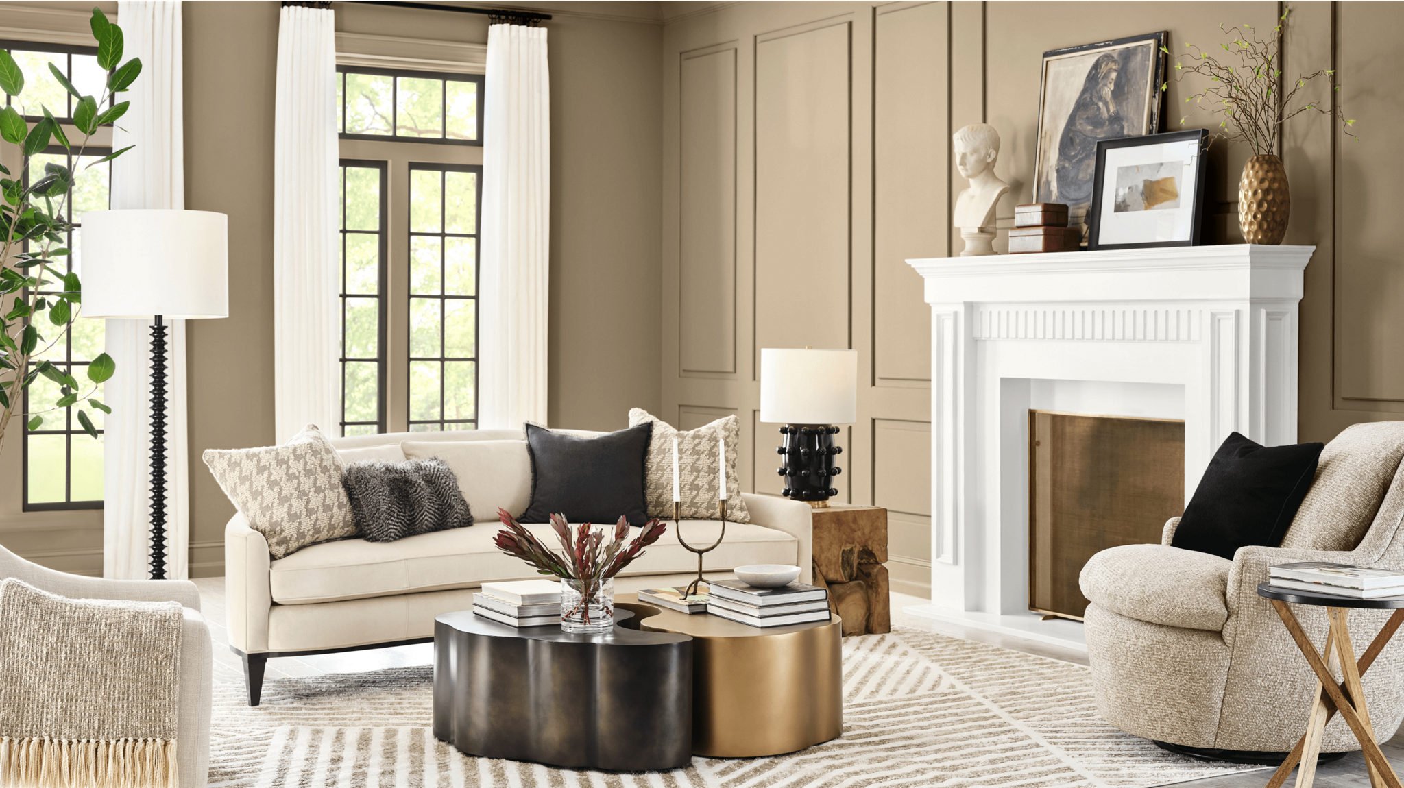
Photo Universal Khaki By Sherwin-Williams
While black and white remain anchors, the 2026 Color of the Year forecasts are pointing toward nuanced neutrals and nature-inspired hues:
Universal Khaki (Sherwin-Williams): A warm, grounded beige that feels fresh again when paired with modern furniture and layered textures.
Hidden Gem (Behr:A smoky jade, offering a new twist on the deep greens that have dominated recent years. Perfect for bold applications like powder rooms or dining spaces.
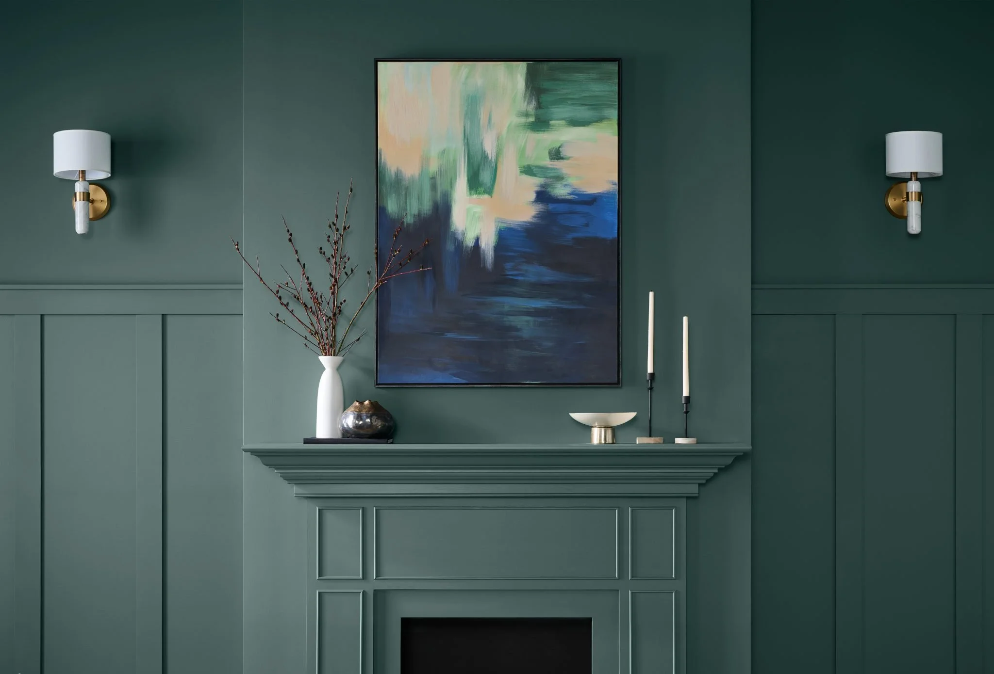
Photo of Hidden Gem by Behr
Where They Shine
Small but Impactful Spaces: Powder rooms and dining rooms are ideal for color drenching in these richer tones.
Historical Contexts: Deeper shades like Hidden Gem feel at home in historic architecture, especially when paired with raw wood or natural stone.
Neutral Backdrops: Universal Khaki creates warmth without overpowering. It avoids the “landlord beige” trap when paired with elevated furnishings. Think velvet greens, modern lighting, and layered textures.
What to Avoid
Our designers agree: the era of the single accent wall is fading fast. Instead of isolating one wall, commit fully to a color or incorporate texture. Consider grasscloth wallpaper or architectural paneling to create an elevated backdrop.
As Evan noted, “An accent wall can feel DIY if it’s just a lone paint choice. But if it’s architectural—like continuing brick from the exterior into the interior—it becomes part of the story.”
Final Thoughts
The interplay of black, white, and emerging “colors of the year” reminds us that design is both timeless and timely. The classics ground us, while fresh hues invite us to reimagine what’s possible.
Whether you’re considering a dramatic black library, a serene whitewashed living room, or a khaki-drenched bedroom, the key is intentionality: choosing colors that suit both your space and the story you want to tell.
At ONYX + ALABASTER, our passion is helping you make those choices. Because when color is done well, it doesn’t just fill a room, it transforms it.