
3 Surprising Paint Colors We Can’t Get Enough Of
When it comes to paint, most of us tend to default to the familiar: whites, soft grays, maybe a moody black accent if we’re feeling bold. But some of the most inspiring transformations happen when you step just a little outside the expected. Our design team has been leaning into colors that surprise us with their sophistication, warmth, and versatility—and the results speak for themselves.
Here are three unexpected shades that have captured our attention lately.
1. Woodbridge by Sherwin Williams
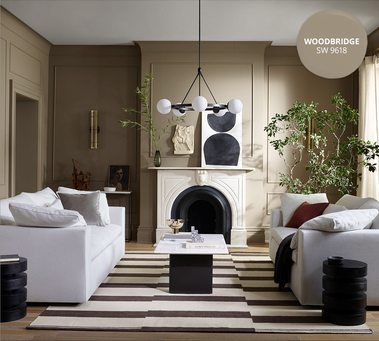
Photo credit: Sherwin Williams
At first glance, Woodbridge reads like a safe choice. But used in a fresh way—through color drenching—it becomes anything but ordinary. Recently, we wrapped an entire modern bedroom in this hue: walls, ceiling, trim, doors, and built-ins all painted in the same shade. The effect? A cocoon-like space that feels calm yet elevated.
For anyone who craves the comfort of neutrals but wants something richer and more memorable, this warm, organic tone strikes the perfect balance. It pairs beautifully with walnut or light oak furniture, and pops of blue add unexpected vibrancy.Pro Tip: When you commit to color drenching, carry it all the way through—even down to the outlet covers and switch plates. Painting them the same shade keeps the room cohesive and polished.
2. Deep Reddish Brown by Farrow and Ball
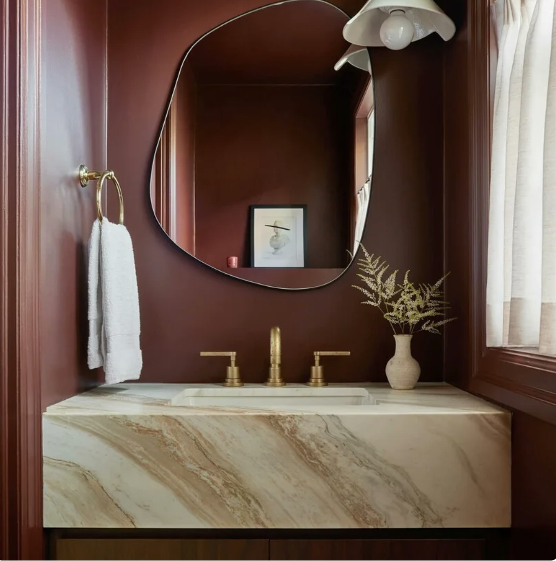
Photo from Farrowandball.com
If you’re ready to go daring, few shades deliver like Farrow & Ball’s Deep Reddish Brown. Moody, dramatic, and saturated, it makes a statement whether used to drench a small space or highlight a single element like cabinetry, doors, or trim.
The key to pulling it off? Keep surrounding furnishings neutral and let the color do the talking. This shade also taps into what designers sometimes call the “Red Theory”—adding a hit of red (or red-adjacent hues) in an unexpected place to instantly energize a room. It’s a move that feels both classic and cutting-edge.
3. After the Storm by Sherwin Williams
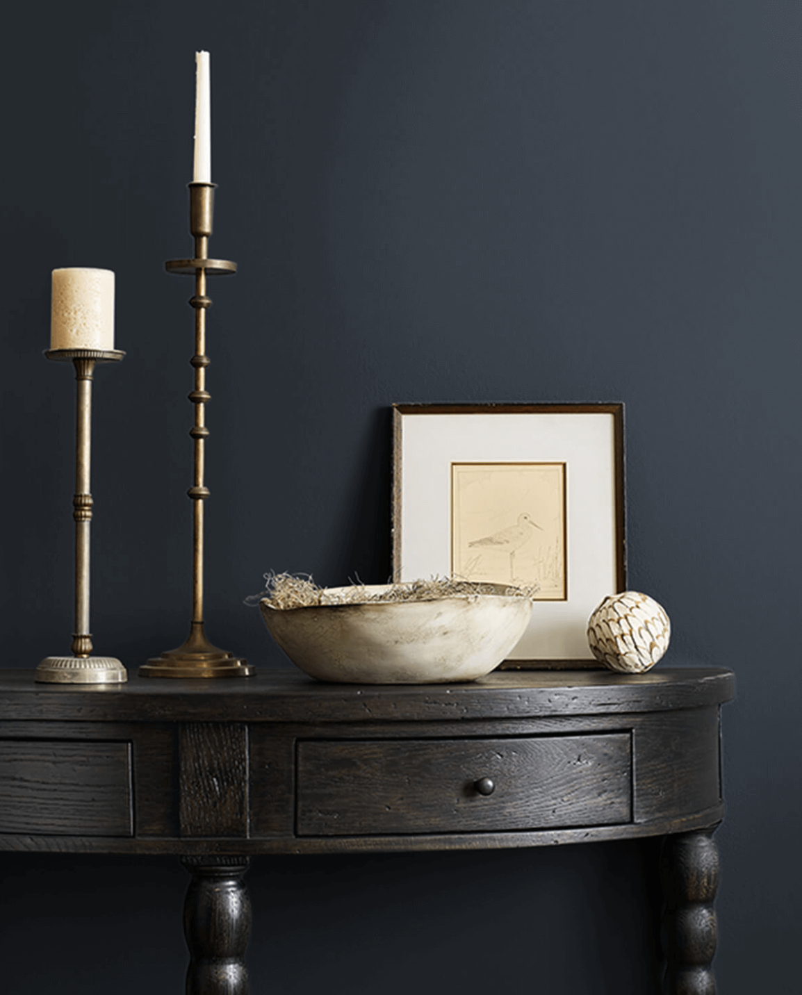
Photo credit: Sherwin Williams
Black has long been a designer go-to for depth and drama, but lately we’ve been reaching for navy instead. Shades like After the Storm offer the same grounding effect, but with a richness and calm that black can’t always achieve.
Think of it as the color that works anywhere you’d typically consider black: on millwork, in a powder bath, an office, or even a formal dining room. Add trim or wainscoting to play up its depth, or layer it with tactile textures for a space that feels both comforting and bold. It’s the color equivalent of slipping into your favorite tailored blazer: timeless, versatile, and effortlessly chic.
Which Would You Try?
These three shades—Woodbridge, Deep Reddish Brown, and After the Storm—prove that stepping slightly outside of your comfort zone with paint can transform a space from safe to striking. Whether you’re wrapping a room in a moody neutral, energizing a corner with a daring pop of red, or swapping black for navy, the right color choice has the power to surprise you in the best way possible.